
STRAIGHTERLINE
ECE County Portal
Role
AI-Assisted Design + Prototype
User Interviews
Branding
Rebuilding a slow, single-brand dashboard into a functional prototype engineering shipped.
Problem
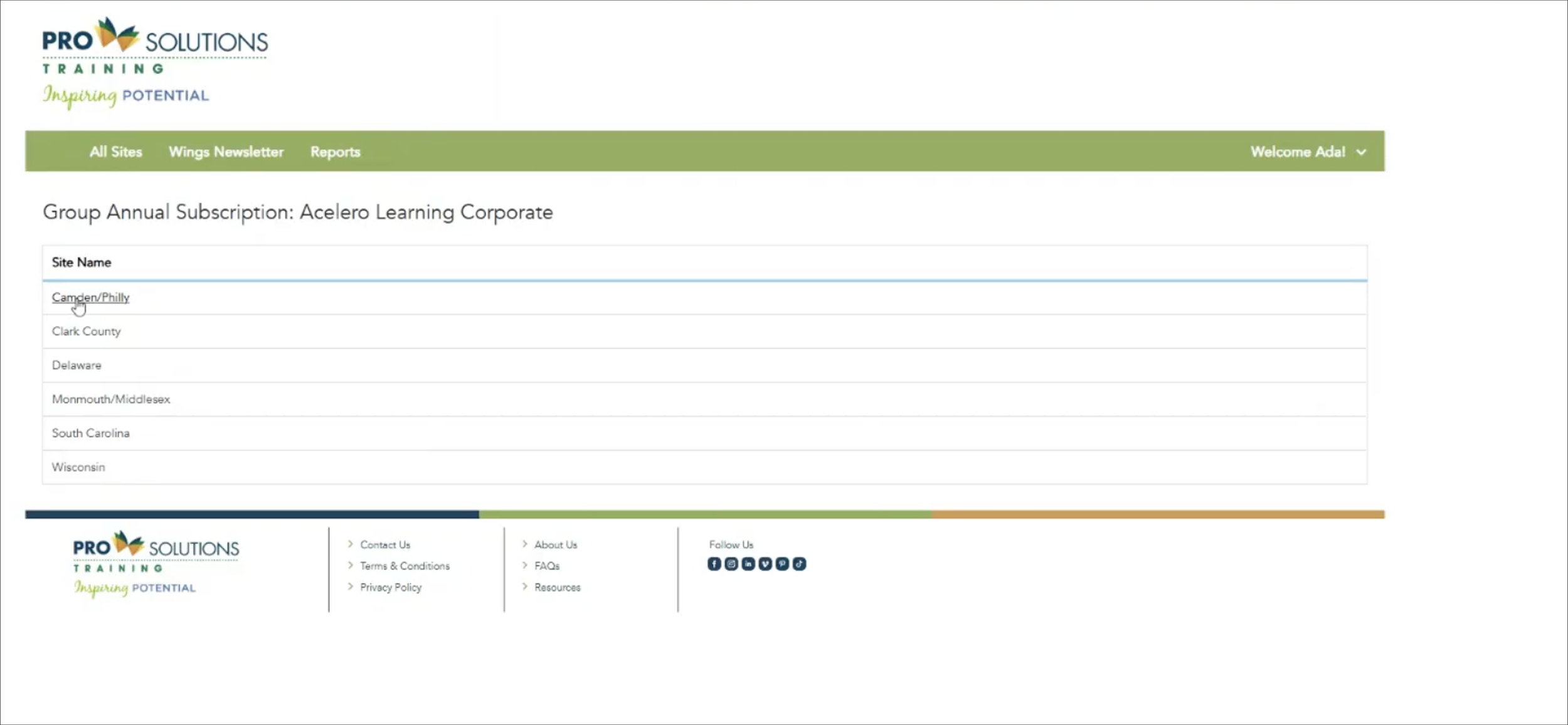
ECE (Early Childhood Education division of StraighterLine) already had a dashboard, but it was slow, hard to use, and branded for only one of the two lines of business it needed to serve, PST (Pro Solutions Training) and CCEI (Childcare Education Institute). It needed shared branding with a swappable logo, while still feeling custom to each individual county client. On top of that, basic usability was broken: it often wasn't clear what was even clickable, and every table used a different data order.
A sales team had already promised a county dashboard tied to a real contract, in a line of business outside the usual day-to-day. The outside estimate was one to two months of design, two to three more of development, at $15,000 to $20,000.
The Solution
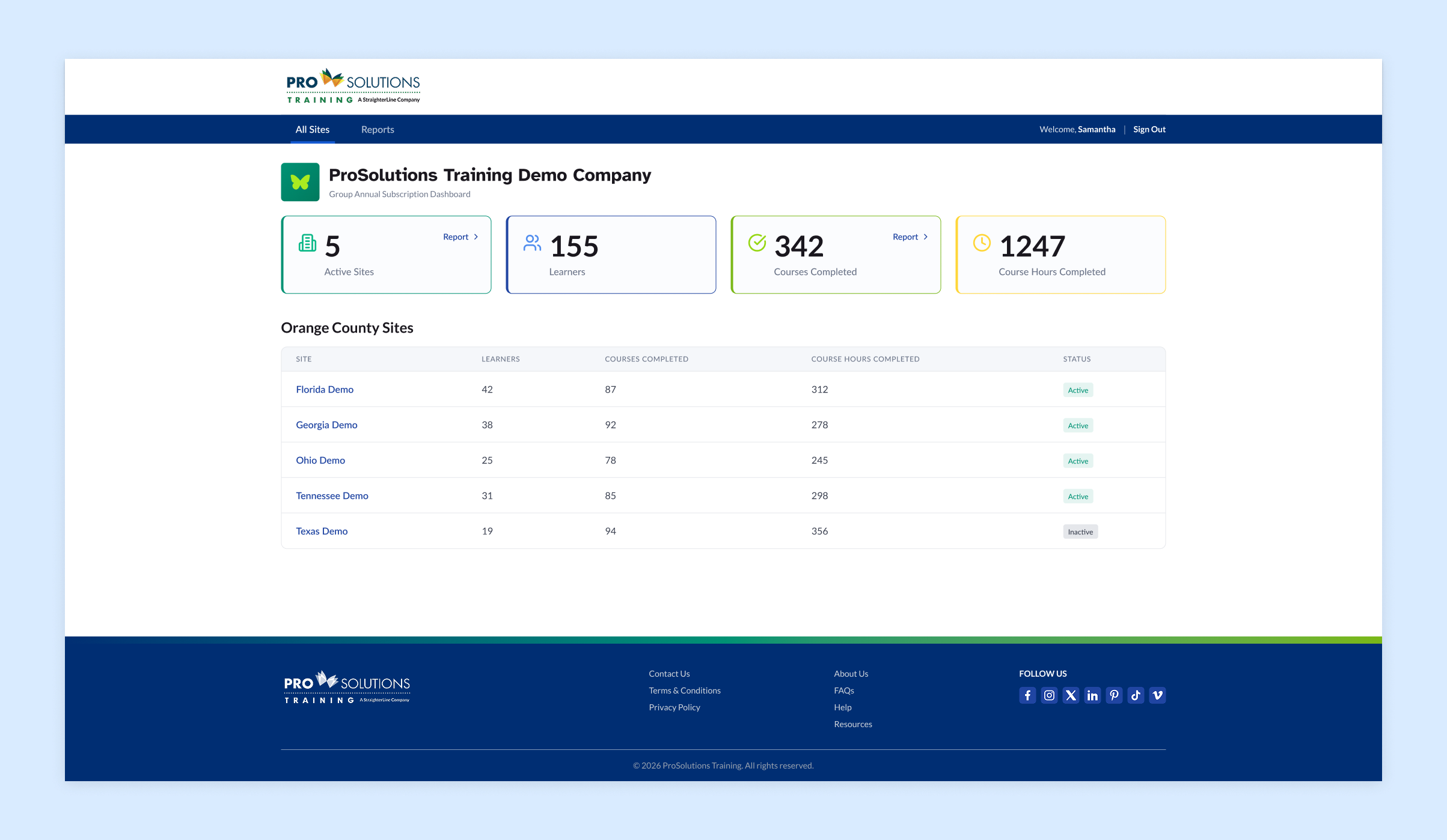
A clean, functional county portal with swappable branding, personalized county messaging, and consistent usability throughout, delivered as a working Figma Make prototype engineering could build straight from.
BEFORE
The Results
A Replaced an outside estimate of 1 to 2 months of design and 2 to 3 months of development, at $15,000 to $20,000, with a fully built dashboard delivered in a single month.
What started as a favor for a team outside normal scope turned into the most fun AI experiment of the year, one that happened to save months and thousands of dollars along the way.
The Approach
Ran user and stakeholder interviews directly, then built a fully functional prototype in Figma Make instead of a static file:
Applied a newly designed StraighterLine branding variant, with unique colors and a custom butterfly icon representing student transformation, built to swap between PST and CCEI
Added custom profile picture upload and a personalized welcome-message area that could handle even long, complex county account names
Rebuilt usability throughout: summary cards linking to exportable data, one consistent design language pulled from the web experience, repeatable hierarchy across every popup and table, and finally, obvious clickability
Prioritized fixes by what mattered most to the client first, rather than fixing everything at once
Discovery and design landed in week one. A final, fully functional prototype followed in week two. The complete, working dashboard was built out over the three weeks after that.